
Importo totale (1 articolo articoli):
Destinazione ordine:

analytics press oakland (12 risultati)
Casa editrice:
analytics press oakland
Perfeziona con la Ricerca avanzata
Vai alla pagina principale dei risultati di ricerca
Filtri di ricerca
Tipo di articolo
- Tutti i tipi di prodotto
- Libri (12)
- Riviste e Giornali (Nessun altro risultato corrispondente a questo perfezionamento)
- Fumetti (Nessun altro risultato corrispondente a questo perfezionamento)
- Spartiti (Nessun altro risultato corrispondente a questo perfezionamento)
- Arte, Stampe e Poster (Nessun altro risultato corrispondente a questo perfezionamento)
- Fotografie (Nessun altro risultato corrispondente a questo perfezionamento)
- Mappe (Nessun altro risultato corrispondente a questo perfezionamento)
- Manoscritti e Collezionismo cartaceo (Nessun altro risultato corrispondente a questo perfezionamento)
Condizioni Maggiori informazioni
- Nuovo (10)
- Come nuovo, Ottimo o Quasi ottimo (1)
- Molto buono o Buono (1)
- Discreto o Mediocre (Nessun altro risultato corrispondente a questo perfezionamento)
- Come descritto (Nessun altro risultato corrispondente a questo perfezionamento)
Legatura
Ulteriori caratteristiche
- Prima ed. (1)
- Copia autograf. (Nessun altro risultato corrispondente a questo perfezionamento)
- Sovracoperta (1)
- Con foto (Nessun altro risultato corrispondente a questo perfezionamento)
- Non Print on Demand (12)
Lingua (1)
Spedizione gratuita
Paese del venditore
Valutazione venditore
-

Big Data, Big Dupe (Paperback)
Da: Grand Eagle Retail, Bensenville, IL, U.S.A.
Valutazione del venditore 5 su 5 stelle

Paperback. Condizione: new. Paperback. Big Data, Big Dupe" is a little book about a big bunch of nonsense. The story of David and Goliath inspires us to hope that something little, when armed with truth, can topple something big that is a lie. This is the authors hope. While others have written about the dangers of Big Data, Stephen Few reveals the deceit that belies its illusory nature. If data is the new oil, Big Data is the new snake oil. It isnt real. Its a marketing campaign that has distracted us for years from the real and important work of deriving value from data. Shipping may be from multiple locations in the US or from the UK, depending on stock availability.
-

The Data Loom (Paperback)
Da: Grand Eagle Retail, Bensenville, IL, U.S.A.
Valutazione del venditore 5 su 5 stelle
Paperback. Condizione: new. Paperback. Contrary to popular myth, we do not yet live in the Information Age. At best, we live the Data Age, obsessed with the production, collection, storage, dissemination, and monetization of digital data. But data, in and of itself, isnt valuable. Data only becomes valuable when we make sense of it.We rely on information professionals to help us understand data, but most fail in their efforts. Why? Not because they lack intelligence or tools, but mostly because they lack the necessary skills. Most information professionals have been trained primarily in the use of data analysis tools (Tableau, PowerBI, Qlik, SAS, Excel, R, etc.), but even the best tools are only useful in the hands of skilled individuals. Anyone can pick up a hammer and pound a nail, but only skilled carpenters can use a hammer to build a reliable structure. Making sense of data is skilled work, and developing those skills requires study and practice.Weaving data into understanding involves several distinct but complementary thinking skills. Foremost among them are critical thinking and scientific thinking. Until information professionals develop these capabilities, we will remain in the dark ages of data.This book is for information professionals, especially those who have been thrust into this important work without having a chance to develop these foundational skills. If youre an information professional and have never been trained to think critically and scientifically with data, this book will get you started. Once on this path, youll be able to help usher in an Information Age worthy of the name. Shipping may be from multiple locations in the US or from the UK, depending on stock availability.
-

Turning Numbers into Knowledge: Mastering the Art of Problem Solving
Lingua: Inglese
Editore: Analytics Press, Oakland, CA, 2001
ISBN 10: 0970601905 ISBN 13: 9780970601902
Da: Blue Skye Books, Novato, CA, U.S.A.
Valutazione del venditore 5 su 5 stelle
Prima edizione
Hardcover. Condizione: Fine. Condizione sovraccoperta: Fine. 1st Edition. OLakland, CA: Analytics, 2001. 1st edition, first book, F/F. Book and dust jacket have very little wear. Illustrated with many figures and tables, drawings. Includes further reading, notes and index. "The first comprehensive guide full of tools, tricks and tips for solving problems in the real world." Nice copy, 221 pp.
-

Turning Numbers Into Knowledge: Mastering the Art of Problem Solving
Lingua: Inglese
Editore: Oakland, CA : Analytics Press, 2008
ISBN 10: 0970601921 ISBN 13: 9780970601926
Da: Barksdale Books, Almere, Paesi Bassi
Valutazione del venditore 5 su 5 stelle
EUR 11,00
Spedizione EUR 20,00
Spedito da Paesi Bassi a U.S.A.Quantit�: 1 disponibili
Aggiungi al carrelloCondizione: Good. Paperback, figures/tables, 8vo.
-
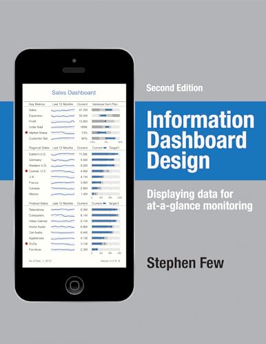
Information Dashboard Design (Hardcover)
Da: Grand Eagle Retail, Bensenville, IL, U.S.A.
Valutazione del venditore 5 su 5 stelle
Hardcover. Condizione: new. Hardcover. A leader in the field of data visualization, Stephen Few exposes the common problems in dashboard design and describes its best practices in great detail and with a multitude of examples in this updated second edition. According to the author, dashboards have become a popular means to present critical information at a glance, yet few do so effectively. He purports that when designed well, dashboards engage the power of visual perception to communicate a dense collection of information efficiently and with exceptional clarity and that visual design skills that address the unique challenges of dashboards are not intuitive but rather learned. The book not only teaches how to design dashboards but also gives a deep understanding of the concepts--rooted in brain science--that explain the why behind the how. This revised edition offers six new chapters with sections that focus on fundamental considerations while assessing requirements, in-depth instruction in the design of bullet graphs and sparklines, and critical steps to follow during the design process. Examples of graphics and dashboards have been updated throughout, including additional samples of well-designed dashboards. Shipping may be from multiple locations in the US or from the UK, depending on stock availability.
-

Now You See It (Hardcover)
Da: Grand Eagle Retail, Bensenville, IL, U.S.A.
Valutazione del venditore 5 su 5 stelle
Hardcover. Condizione: new. Hardcover. Before you can present information to others, you must understand its story. Now You See It teaches the concepts, principles, and practices of visual data sensemaking. The skills taught in this book rely primarily on something that most of us possessvisioninteractively using graphs to find and examine the meaningful patterns and relationships that reside in quantitative data. Although some questions about quantitative data can only be answered using sophisticated statistical techniques, most can be answered using relatively simple visual data sensemaking skills. Until Now You See It was published, no book taught these basic skills comprehensively and in a way that was accessible to a broad audience. Even though these skills can be developed by anyone with eyes to see, they are not intuitivethey must be learned. Without these skills, even the best data visualization tools are of little use, and data will remain nothing but noise. Shipping may be from multiple locations in the US or from the UK, depending on stock availability.
-

Show Me the Numbers (Hardcover)
Da: Grand Eagle Retail, Bensenville, IL, U.S.A.
Valutazione del venditore 5 su 5 stelle
Hardcover. Condizione: new. Hardcover. Addressing the prevalent issue of poorly designed quantitative information presentations, this accessible, practical, and comprehensive guide teaches how to properly create tables and graphs for effective and efficient communication. The critical numbers that measure the health, identify the opportunities, and forecast the future of organizations are often misrepresented because few people are trained to design accurate, informative materials, but this manual helps put an end to misinformation. This revised edition of the highly successful book includes updated figures and 91 additional pages of content, including new chapters about quantitative narrative and current misuses of graphs--such as donut, circle, unit, and funnel charts--and new appendices that cover constructing table lens displays and box plots in Excel and useful colour palettes for presentation materials. Addressing the prevalent issue of poorly designed quantitative information presentations, this accessible, practical, and comprehensive guide teaches how to properly create tables and graphs for effective and efficient communication. The critical numbers that measure the health, identify the opportunities, and forecast the future of organizations are often misrepresented because few people are trained to design accurate, informative materials, but this manual helps put an end to misinformation. This revised edition of the highly successful book includes updated figures and 91 additional pages of content, including new chapters about quantitative narrative and current misuses of graphs--such as donut, circle, unit, and funnel charts--and new appendices that cover constructing table lens displays and box plots in Excel and useful color palettes for presentation materials. Shipping may be from multiple locations in the US or from the UK, depending on stock availability.
-
The Data Loom (Paperback)
Da: AussieBookSeller, Truganina, VIC, Australia
Valutazione del venditore 5 su 5 stelle
EUR 31,89
Spedizione EUR 31,28
Spedito da Australia a U.S.A.Quantit�: 1 disponibili
Aggiungi al carrelloPaperback. Condizione: new. Paperback. Contrary to popular myth, we do not yet live in the Information Age. At best, we live the Data Age, obsessed with the production, collection, storage, dissemination, and monetization of digital data. But data, in and of itself, isnt valuable. Data only becomes valuable when we make sense of it.We rely on information professionals to help us understand data, but most fail in their efforts. Why? Not because they lack intelligence or tools, but mostly because they lack the necessary skills. Most information professionals have been trained primarily in the use of data analysis tools (Tableau, PowerBI, Qlik, SAS, Excel, R, etc.), but even the best tools are only useful in the hands of skilled individuals. Anyone can pick up a hammer and pound a nail, but only skilled carpenters can use a hammer to build a reliable structure. Making sense of data is skilled work, and developing those skills requires study and practice.Weaving data into understanding involves several distinct but complementary thinking skills. Foremost among them are critical thinking and scientific thinking. Until information professionals develop these capabilities, we will remain in the dark ages of data.This book is for information professionals, especially those who have been thrust into this important work without having a chance to develop these foundational skills. If youre an information professional and have never been trained to think critically and scientifically with data, this book will get you started. Once on this path, youll be able to help usher in an Information Age worthy of the name. Shipping may be from our Sydney, NSW warehouse or from our UK or US warehouse, depending on stock availability.
-
Big Data, Big Dupe (Paperback)
Da: AussieBookSeller, Truganina, VIC, Australia
Valutazione del venditore 5 su 5 stelle
EUR 31,91
Spedizione EUR 31,28
Spedito da Australia a U.S.A.Quantit�: 1 disponibili
Aggiungi al carrelloPaperback. Condizione: new. Paperback. Big Data, Big Dupe" is a little book about a big bunch of nonsense. The story of David and Goliath inspires us to hope that something little, when armed with truth, can topple something big that is a lie. This is the authors hope. While others have written about the dangers of Big Data, Stephen Few reveals the deceit that belies its illusory nature. If data is the new oil, Big Data is the new snake oil. It isnt real. Its a marketing campaign that has distracted us for years from the real and important work of deriving value from data. Shipping may be from our Sydney, NSW warehouse or from our UK or US warehouse, depending on stock availability.
-
Information Dashboard Design (Hardcover)
Da: AussieBookSeller, Truganina, VIC, Australia
Valutazione del venditore 5 su 5 stelle
EUR 76,85
Spedizione EUR 31,28
Spedito da Australia a U.S.A.Quantit�: 1 disponibili
Aggiungi al carrelloHardcover. Condizione: new. Hardcover. A leader in the field of data visualization, Stephen Few exposes the common problems in dashboard design and describes its best practices in great detail and with a multitude of examples in this updated second edition. According to the author, dashboards have become a popular means to present critical information at a glance, yet few do so effectively. He purports that when designed well, dashboards engage the power of visual perception to communicate a dense collection of information efficiently and with exceptional clarity and that visual design skills that address the unique challenges of dashboards are not intuitive but rather learned. The book not only teaches how to design dashboards but also gives a deep understanding of the concepts--rooted in brain science--that explain the why behind the how. This revised edition offers six new chapters with sections that focus on fundamental considerations while assessing requirements, in-depth instruction in the design of bullet graphs and sparklines, and critical steps to follow during the design process. Examples of graphics and dashboards have been updated throughout, including additional samples of well-designed dashboards. Shipping may be from our Sydney, NSW warehouse or from our UK or US warehouse, depending on stock availability.
-
Show Me the Numbers (Hardcover)
Da: AussieBookSeller, Truganina, VIC, Australia
Valutazione del venditore 5 su 5 stelle
EUR 81,59
Spedizione EUR 31,28
Spedito da Australia a U.S.A.Quantit�: 1 disponibili
Aggiungi al carrelloHardcover. Condizione: new. Hardcover. Addressing the prevalent issue of poorly designed quantitative information presentations, this accessible, practical, and comprehensive guide teaches how to properly create tables and graphs for effective and efficient communication. The critical numbers that measure the health, identify the opportunities, and forecast the future of organizations are often misrepresented because few people are trained to design accurate, informative materials, but this manual helps put an end to misinformation. This revised edition of the highly successful book includes updated figures and 91 additional pages of content, including new chapters about quantitative narrative and current misuses of graphs--such as donut, circle, unit, and funnel charts--and new appendices that cover constructing table lens displays and box plots in Excel and useful colour palettes for presentation materials. Addressing the prevalent issue of poorly designed quantitative information presentations, this accessible, practical, and comprehensive guide teaches how to properly create tables and graphs for effective and efficient communication. The critical numbers that measure the health, identify the opportunities, and forecast the future of organizations are often misrepresented because few people are trained to design accurate, informative materials, but this manual helps put an end to misinformation. This revised edition of the highly successful book includes updated figures and 91 additional pages of content, including new chapters about quantitative narrative and current misuses of graphs--such as donut, circle, unit, and funnel charts--and new appendices that cover constructing table lens displays and box plots in Excel and useful color palettes for presentation materials. Shipping may be from our Sydney, NSW warehouse or from our UK or US warehouse, depending on stock availability.
-
Now You See It (Hardcover)
Da: AussieBookSeller, Truganina, VIC, Australia
Valutazione del venditore 5 su 5 stelle
EUR 87,60
Spedizione EUR 31,28
Spedito da Australia a U.S.A.Quantit�: 1 disponibili
Aggiungi al carrelloHardcover. Condizione: new. Hardcover. Before you can present information to others, you must understand its story. Now You See It teaches the concepts, principles, and practices of visual data sensemaking. The skills taught in this book rely primarily on something that most of us possessvisioninteractively using graphs to find and examine the meaningful patterns and relationships that reside in quantitative data. Although some questions about quantitative data can only be answered using sophisticated statistical techniques, most can be answered using relatively simple visual data sensemaking skills. Until Now You See It was published, no book taught these basic skills comprehensively and in a way that was accessible to a broad audience. Even though these skills can be developed by anyone with eyes to see, they are not intuitivethey must be learned. Without these skills, even the best data visualization tools are of little use, and data will remain nothing but noise. Shipping may be from our Sydney, NSW warehouse or from our UK or US warehouse, depending on stock availability.